Painted Light: How Color Grading Quietly Controls Everything You Feel at the Movies

Photo: User: (WT-shared) CONOCER at wts wikivoyage, Public domain, via Wikimedia Commons
There's a moment early in Blade Runner 2049 where Ryan Gosling's K walks through a vast, amber-soaked wasteland outside Los Angeles. Nothing about the landscape should feel alive — it's barren, post-apocalyptic, genuinely desolate. And yet, somehow, it feels melancholy rather than terrifying. That's not an accident. That's color doing its job.
Color grading — the process of digitally adjusting the hues, contrast, shadows, and saturation of a finished film — is arguably the most invisible form of visual storytelling in cinema. Audiences absorb it completely without registering it consciously. But pull back the curtain just a little, and you start to see how thoroughly it shapes your emotional experience from the very first frame.
What Color Grading Actually Is (And Isn't)
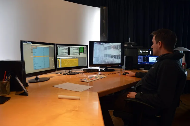
Let's clear something up first. Color grading isn't just slapping a filter on footage the way you might tweak an Instagram post. It's a meticulous, intentional craft — often handled by a dedicated colorist working alongside the director and cinematographer — that can take weeks to complete on a major feature film.
The process involves manipulating everything from the warmth of shadows to the specific green tint in a fluorescent light to the way skin tones render under overcast skies. It's surgical. And the decisions made in the color suite can fundamentally change what a scene means, not just what it looks like.
Think of it this way: the same footage graded in cool blue tones versus warm amber reads as two entirely different emotional realities. One feels clinical, isolated, maybe threatening. The other feels nostalgic, intimate, or dangerous in a completely different way. Same pixels. Wildly different feelings.
Bong Joon-ho's Green and the Class Divide in Parasite
Few films in recent memory have used color with as much deliberate precision as Parasite. Cinematographer Hong Kyung-pyo and Bong Joon-ho constructed a visual grammar built around two distinct palettes that tracked the film's central tension between wealth and poverty.
The Park family's modernist hilltop home is bathed in clean, natural light — warm but controlled, like a lifestyle magazine shoot. The colors breathe. Contrast that with the Kim family's semi-basement apartment, where a sickly greenish tint creeps into the shadows, the light always feeling slightly wrong, slightly insufficient.
As the Kim family infiltrates the Park household, watch how their color world shifts. They temporarily inhabit the warmth of the upper class. But the palette never fully accepts them — and that visual discomfort telegraphs the film's ultimate tragedy long before the plot does. The color grade isn't decorating the story. It is the story, running in parallel.
The Isolated Grays of The Lighthouse
Robert Eggers shot The Lighthouse in black and white on a nearly square 1.19:1 aspect ratio, invoking the look of early 20th-century photography. But the specific grade of that black and white matters enormously. This isn't the lush, high-contrast monochrome of classic Hollywood glamour. It's murky, grain-heavy, and claustrophobic.
Eggers and cinematographer Jarin Blaschke pushed toward a look that feels like it was pulled from a waterlogged daguerreotype. The whites never quite reach pure white. The blacks swallow detail. The result is an image that feels physically uncomfortable — like the film itself is decaying around you.
That visual unease does something remarkable: it puts you inside the psychological deterioration of the two lighthouse keepers before their behavior even tips into the overtly disturbing. You feel wrong before you can articulate why. That's color (or its absence) working on your nervous system directly.
Blade Runner 2049 and the Grammar of Desolation
Back to Denis Villeneuve's neo-noir masterpiece. Cinematographer Roger Deakins — who won a long-overdue Oscar for the film — constructed distinct color worlds for each of the movie's locations, and each one carries specific emotional weight.
The orange, dust-choked hellscape of the protein farm sequences reads as suffocating and degraded. Las Vegas, buried under perpetual sandstorm, burns in amber and rust — a graveyard that still somehow glows. The LAPD headquarters pulses with cold blue-gray. And the sterile white of the Wallace Corporation facility feels genuinely terrifying in its purity.
Deakins has talked about how these weren't just aesthetic choices — they were narrative ones. Each space needed to feel like a different kind of future, a different flavor of dystopia. The color grade is essentially world-building, communicating societal information that would take pages of exposition to explain in dialogue.
Why You Feel It Without Knowing It
Here's the thing that makes color grading so fascinating from a viewer's perspective: your brain processes color emotionally before it processes it intellectually. The limbic system — the part of your brain handling emotion and memory — responds to visual stimuli faster than your conscious mind can analyze it.
This is why you might feel vaguely uneasy during a scene without being able to point to a specific reason, or why a flashback sequence feels different even before you consciously register that it's a flashback. Colorists exploit this gap between feeling and understanding constantly.
The warm, desaturated tones that dominate so many prestige dramas? They're signaling authenticity and emotional weight. The hyper-saturated, almost candy-colored palettes in films like Everything Everywhere All at Once? They're telling you to hold reality loosely, to stay open to the absurd. You received that message before the first joke landed.
Spotting It Yourself
The best way to start seeing color grading at work is to pick any film with a strong visual identity and watch a single scene twice: once normally, and once with the sound off. Without dialogue and score pulling your attention, the visual language becomes much louder.
Notice where the shadows fall warm versus cool. Check whether skin tones look naturalistic or slightly pushed in a particular direction. See if the background and foreground share the same color temperature or if they've been separated to create visual hierarchy.
Once you start looking, you'll find it everywhere — in the sickly fluorescence of a hospital drama, the golden-hour warmth of a romantic comedy's third act, the desaturated grays of a political thriller trying to feel journalistic and serious.
Every frame of every movie you've ever loved was colored intentionally. Someone made specific, considered choices about exactly how that image would land in your eyes. And those choices shaped how the story lived in your memory afterward.
That's not a technical footnote. That's storytelling at its most elemental — light itself, bent to emotional purpose.